The 1922 Chicago Tribune Tower Contest
Lasting impact on American Architecture
Enduring Influence of the 1922
Chicago Tribune Tower Contest
In 1922, the Chicago Tribune hosted an international design competition for its new headquarters and offered a $50,000 prize for "the most beautiful and eye-catching building in the world". The competition worked brilliantly as a publicity stunt, and the resulting entries still reveal a unique turning point in American architectural history. More than 260 entries were received.
Considering that the Tribune's owner, Colonel Robert McCormack was an enemy of almost anything progressive (The Trib's motto was " An American Paper for Americans"), it is very surprising that the competition attracted a wide spectrum of European architechts who were quite well known for their left-wing, modernist views:
- Walter Gropius
- Bertram Goodhue
- Bruno Taut
- Adolf Loos,
- Knut Lonberg-Holm
The winning entry was a neo-Gothic (i.e. neither left wing nor Modern) design by New York architects John Mead Howells and Raymond Hood. The design uses structural shapes (ogival arches) and ornamentation (gargoyles) and is capped with Flying Buttresses at the top. Gothic-skyscraper styles were the vogue in 1922, based on precedent set by the
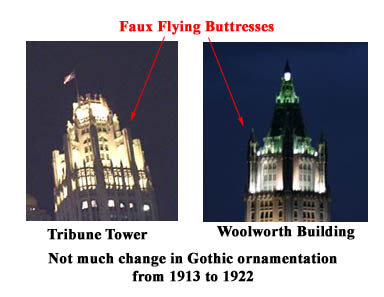
The Tribune Tower and the Woolworth Building Are Very Impressive at Night
The entry that many perceived as the bestóa radically simplified tower by the Finnish architect Eliel Saarinen ó took second place. Saarinen's tower, which anticipated the coming impact of stripped-down modernism on building form, was preferred by critics like Louis Sullivan, and was a strong influence on the next generation of skyscrapers.
It is well-known that Saarinenís design strongly influenced Raymond Hood's own subsequent work on the American Radiator Building (1924). The 1929 Gulf Building in Houston, Texas, designed by architects Alfred C. Finn, Kenneth Franzheim, and J. E. R. Carpenter, is a full realization of that Saarinen design. Cťsar Pelli's 181 West Madison Street Building in Chicago is also thought to be inspired by Saarinen's design (although almost all of Pelli's buildings look alike....)
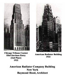
Influence of Saarinen Design on the Radiator Building
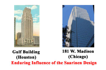
Saarinen Influence in Chicago and Houston
The third place entry was submitted by Walter Gropius, best known as the founder of the Bauhaus in Dessau, Germany. Note that his design for the Tribune building shares many of the same attributes as his iconic design for the Bauhaus building.
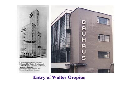
Window Walls and Horisontal Stripes
Honorable mention went to Alfred Fellheimer, known as a designer of theaters and railroad stations. His most famous work is the fabulous Cincinatti Union Terminal
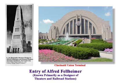
Fellheimer's Obelisk and Arched Terminal
All 260 entries may be viewed in all their glory in a new book The Chicago Tribune Tower Competition : Skyscraper Design and Cultural Change in the 1920s by Katherine Solomonson and Richard A. Etlin ($27.00).
Here is an interesting article summarizing the "skyscraper" movement up to 1932
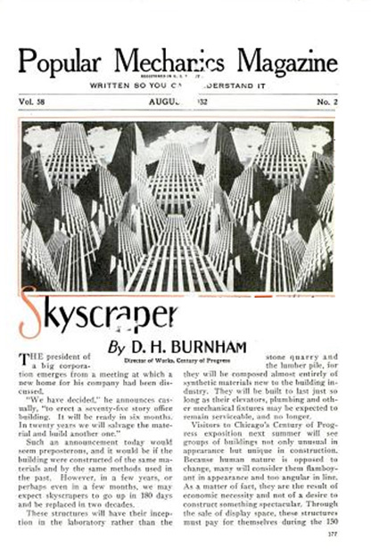
The Skyscraper in 1932
On the Cusp of the Depression
From the August 1932 issue of Popular Mechanics
Click Here to download the entire article
Click to Enlarge
As I was reviewing the various, entries, I was led to some very interesting observations about the extent to which this contest influenced decades of architecture.
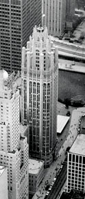
Before I get into those observations, let's look at the Tribune Tower itself.
The Building
Construction of the 462 foot high Tribune Tower was completed in 1925.
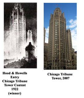
The Winning Design for the Tribune Tower
Rene Paul Chambellan contributed his sculpture talents to the buildings ornamentation, gargoyles and the famous Aesop Screen over the main entrance doors.
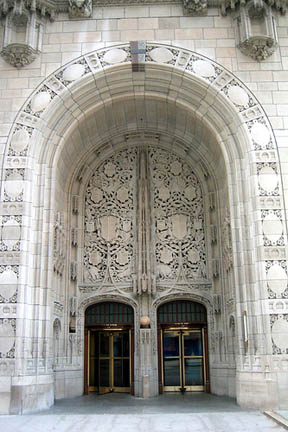
The Aesop Screen over the Front Entrance to the Tribune Tower
Rene Chambellan worked on other projects with Raymond Hood including the American Radiator Building and Rockefeller Center in New York City, also providing all of the modeling work for that project. Also, among the gargoyles on the Tribune Tower is one of a frog, created by Rene Chambellan to represent himself -- jokingly as he is of French ancestry. The tower also features carved images of Robin Hood (Hood) and a howling dog (Howells) near the main entrance to commemorate the architects.
Artifacts from historically important sites throughout the world have been incorporated into the walls. Parts from the Taj Mahal, the Parthenon, the Great Pyramid, The Alamo, Notre-Dame, Abraham Lincolnís Tomb, the Great Wall of China, the Berlin Wall and 128 others may be seen. The collection is not fixed -- a moon rock was displayed and a piece of steel recovered from the World Trade Center was added.
Influences on Raymond Hood
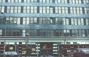
Raymond Hood was a very gifted architect who is best known for his work on Rockefeller Center, particularly the Tower at ď30 RockĒ. He is also known for the striking McGraw Hill building and the stunning black granite National Radiator Building in London. Other entries in the Tribune Tower Contest of 1922 seem to have also influenced these works. Letís start with the ďjokeĒentry of Adolph Loos, who was no fan of Colonel McCormick, the far-right-wing publisher of the Trib.
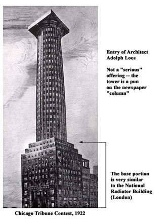
Keep Your Eye on the Base
Note that the "Gestalt"of the Loosí entry is an elaborate pun on the newspaper ďcolumnĒ. Lost in this humor is the base, a very nicely proportioned 12 story building. The influence of this base on Hoodís National Radiator Building (in London) is very striking.
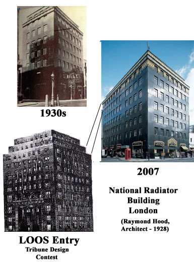
Ifluence of the Loos Base on the National radiator Building, London
The entry of Danish architect Knut Lonberg-Holm had been lost to the ages until its recent publication. However, as shown below, it is a clear source of inspiration for the McGraw-Hill Building. Most noticeable is the setback above the thirty-first floor. When the McGraw-Hill publishing Company occupied the building, this setback housed the corporate offices.
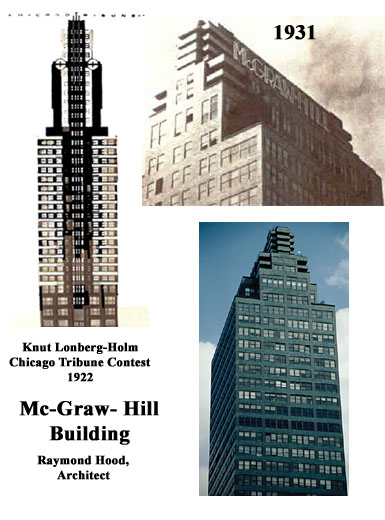
Knut Longren Entry and the McGraw-Hill Building
This provides a transition between the main mass of the building and the ornate horizontal "crown" that is noticeable in the Longren entry as well. The crown hides the mundane elements of the building -- water tanks, elevators and ventilators. The sign itself was painted with bright colors, although since McGraw-Hill vacated the premises, the company's name has been painted over.
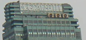
Crown of the McGraw-Hill Building
The entrance on Forty-second Street consists of alternating blue and green enameled steel bands with raised bronze and chrome-nickel steel bars -- the ornament continues into the blue-green enameled lobby. The ornament was waxed to retain a satin finish. Even the elevator cabs were finished in baked green enamel on steel. The elevator operators wore green uniforms with silver stripes.
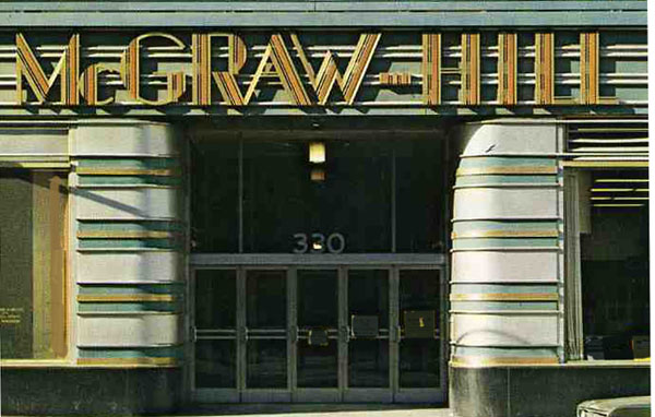
Main Entrance to the McGraw-Hill Building
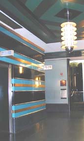
Elevator Lobby the McGraw-Hill Building
The metal covered vertical piers are painted a dark green-blue, almost black. The metal windaws are painted an apple green color. A narrow band of vermillion is painted on the face of the top jambs of the windows and across the face of the metal covered piers. Vermillion is also used on the underside of the horizontal projections on the penthhouse. The golden color of the window shades complements the cool tone of the building. The shades have a broad blue-green vertical stripe in the center tying them into the general color sheme.
The most surprising element of the interior design is the conservative decorative scheme of the corporate offices. While the exterior and public spaces of the building make a modernistic statement, the corporate offices are styled in a traditional Georgian fashion, complete with fielded paneling, crossetted enfrarnenents and the like
The McGraw-Hill Building, Entrance and Color Detail
Some of the "gloss" of Hood's creativity (and the similarity to Lonberg's design) can be reduced by more mundane considerations: The McGraw-Hill building is an elegant solution to a real physical problem -- before air conditioning and fluorescent lights, space that was more than 27 feet from a window could not be rented. Thant meant that buildings could not be more than 94 feet wide ( 27 + 27 + 2 elevator shafts at 20 feet). The "Thin Slab" building was a fairly elegant approach -- almost all the space was rentable! The only problem was that many people could not accept "slabs" and wanted something like a castle.
The Last Word
Apparently, there is no design so outlandish that it cannot find expression, especially in the inscrutable Far East:
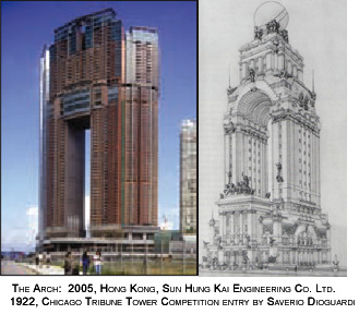
Entry of Saverio Dioguardi in 1922 and Realization in Hong Kong
Please Contact Me if I have made any mistakes here or if you want to contribute to the discussion. I am eager to be illuminated...
Counter for the Entire Site (not just this page..)
Home | About Lindy | 1940s Collectibles | Upcoming Events | Vintage Clothing
The Guide - Establishments - Travel - Accessories
Music | Links | Photo Gallery | Extras | Contact